6 common landing page mistakes to avoid

Landing page is a special page on a site created for a specific purpose, either to offer a product, service, free download, and others. Landing page, if done correctly, can bring maximum results. Here’s a quick glance of 6 common landing page mistakes to avoid when creating a landing page.

1. Not having a clear objective

If the landing page force visitors to think hard to understand the essence of your proposed offer, then certainly there is something wrong on your landing page. Ideally, when someone entered your landing page, they can immediately know what to do or what is offered to them. A landing page should also be clear so that the story flow to be conveyed can be captured easily by your visitors.

2. Using the wrong image

Okay, you probably already include images in your landing page. However, these images do not support the content of the landing page. Instead they may actually confuse your visitors. Try using captivating and impactful images that can show your products / services and communicating its usefulness to your visitors.

3. No testimonial

Nowadays people tend to research a product or service reviews before making a decision to buy it. Testimonials on the landing page will support your credibility. But, not just any testimonial! Show some impressive and positive testimonials from real people who actually have tried the product or service, making it more convincing to the visitors that are interested in your offer.

4. No Call-To-Action

Are your CTA placement easily found by visitors? What about the color and font that is used, whether it is sufficient to grab the attention of visitors? Then, if the CTA is encouraging visitors to take an action that you expect? If you answer NO from one of the questions above, then you need to rethink the design and position of your CTA to be more prominent and persuasive.

5. Form too complicated

You need to remember, usually the goal of a landing page is to gather information from visitors related to what you are offering to them. So, create a form whose contents are relevant and clearly without rambling. Do not lead the visitors into a complex form which are not interesting.

6. Keep it English and simple

Language or terms should not be too technical or too niche. Ensure the content of your landing page resonates what is sought by visitors who you are targeting. Do a study of the words that are often used by your visitors while searching for the type of services / products.

Why your website needs to be mobile responsive design?

Earlier this year Google announced an update to their search engine algorithm that will reward mobile-friendly sites with a higher search ranking. This algorithm update is closing in now with the update scheduled for April 21st.

This move by Google to reward mobile responsive design sites compel companies to start developing their websites to be mobile-friendly. The recent trends in online marketing have shown that the amount of consumers that are using their mobiles to research and purchase products has increased dramatically.

Google also explained that the new algorithm will expand its use of ‘mobile-friendliness’ as a ranking signal. As a result of this, Google search engine users will find it easier to get relevant, high quality search results that are optimised for their device.

What Is Mobile Responsive Design?

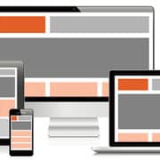
Responsive web design allows a site’s layout to change as the screen size being used to view that site changes. A wide screen display can receive a site design with multiple columns of content while a small screen can have that same content presented in a single column with text and links that are appropriately sized to be read and used on that smaller display.

SmartSite = Mobile Responsive Design?

Yes definitely, and more! Our Web Design Agency is packed with great features that not only look really good but it generates more signups which can boost sales as well. We do this by creating a compelling yet beautiful story for your business.

To learn more about ensuring your site is mobile-friendly, talk to a member of our team at FASTARTUP.

10 Killer Logo Design Checklist For Businesses

After dozens of logo design briefs for clients, we can finally present to you our very own logo design checklist. Your logo is the signature of your brand, and one of your business’ most valuable asset. It is the single element that will symbolise your brand more than anything else. A well-designed logo is one that reflects your business and communicates your message. It needs to be simple, unique, memorable, versatile, and able to work without colour.

10 Killer Logo Design Checklist

#1 What is it that you don’t like about your current logo?

#2 What is your core business?

#3 Who is your target market?

#4 Who are your main competitors?

#5 What makes you stand out from your competitors?

#6 What qualities do you want your company to project?

#7 What emotions do you want your new logo to have?

#8 Do you have a tag line for your logo?

#9 What mediums will your logo be used on? Print, web and/or videos?

#10 Are you partial to typographic logos (ESPN or FedEx), symbolic logos (Apple or Nike), or a combination of both (Adidas or Pepsi)?

We hope our checklist helps you in your logo design thought processPlease share your thoughts in the box below.

How to choose the best colour for your logo [Part 3]

What to Consider | Who are my competitors?

Know your competition. Know what their branding look and feel like. Experts advise new brands to specifically target logo colors that differentiate them from their more established competitors. Do not be a “me-too”. Strive to stand out and assert your brand.

Studies have found that our brains prefer recognizable brands. The sooner you can assert your differentiated brand from your competitors, the better you can entrench yourself into your target market’s consciousness.

What to Consider | How will my logo be used?

Don’t forget to also think about the logistical implications of the color you’ll choose for your logo. Listed below are some things you might want to consider:

  • Level of visibility
    How can you make it as readable as possible in every angle, even from far away? How can you use color to increase legibility?
  • Production in various media
    How will your logo be used in various web and print media? What is the cost impact of mass-producing your products and marketing materials given your chosen color scheme (i.e. monochrome printing is less expensive than colored printing)?
  • Brand palette
    What other colors will harmoniously work with your chosen logo color so you can create a brand color palette/scheme? How will it support your logo in conveying your brand personality and a unified message?

How to choose the best colour for your logo [Part 2]

What to Consider | Who is my target audience?

Decide who your target audience is. Be as specific as you can. Define their country, religion, gender, age group, etc. Once your market is more tangible in your mind, you can start making intelligent guesses as to how your company can effectively and realistically reach them. This, in turn, influences how you structure your brand personality.

Know your target audience’s milieu. Remember that colour can have different associations and historical contexts in each country. Religions also assign spiritual meanings to various colours. It’s also been found that there are subtle differences in colour that men cannot perceive as well as women.

A 2011 study concluded that predicting your consumer’s reaction to the appropriateness of a color in relation to a product is more important than choosing the colour itself. So know what’s appropriate for your audience and build your logo from there.

What to Consider | What is my brand personality?

Colour influences consumers as to their perceived personality of a brand. You colour of choice must support the personality you want to portray. Another way of putting it is your colour must “fit” what you are selling.

You brand personality shouldn’t need a 2-3 paragraph explanation. It should be visceral—in the millisecond it takes for a consumer to glance at it, your logo should have conveyed your brand personality. Ultimately, it is about creating a feeling, mood, or image. Colour can be a powerful tool in doing just that.

Need a logo design work to be done? Click here and we will be in touch shortly.

How to choose the best colour for your logo [Part 1]

Why Color Matters

You company logo is your main brand identifier. It will appear in all your product and marketing materials. It will be your foremost visible advertisement to the world. With this in mind, your logo needs to be distinctive and carry your core brand message.

The color/s of your logo is the main guide upon which your brand color scheme should be based on. This palette, in turn, will be applied to your product packaging and marketing materials. If you choose your logo color wisely and you apply its corresponding palette consistently, you can seed and nurture recognition for your brand in your target audience.

People make a subconscious judgment about a person, environment, or product within 90 seconds of initial viewing. Between 60%-90% of that assessment is based on color alone – Impact of Color on Marketing, 2006


Why It’s Not So Simple

Choosing your logo color should not be as arbitrary as applying your favorite color to it just because you’re the company owner. It is also not as simple as picking out a color based on some table of stereotyped color associations you found in some marketing blog.

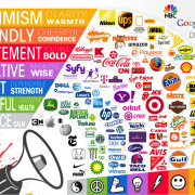
Take heed that a lot of the conversations today about the psychology of color and how it relates to marketing mostly consist of hunches and anecdotal evidence. As yet, there is limited research on this field that’s backed with hard data. What experts do agree on is that our perception of color is highly dependent on our personal contexts and experiences. Yellow, for example, might mean humility to Buddhist monks, but it is also associated with cowardice in a Western setting.

Everyone perceives colors differently. We can’t ascribe a universal emotional effect to a specific color because how we see a color will always be affected by factors such as our past experiences, culture, religion, natural environment, gender, race, and nationality.

What nearly every academic study on color and branding tells us though, is that your brand colors should support the brand personality you want to portray rather than aligning them with cliché associations. We should also look to established brands to learn the “standards” they’ve set with regard to expressing their personalities through the colors they’ve chosen.